About Me
Born in London, living in the beautiful vale of Evesham. I'm a self starting creative all-rounder who has worked with start-ups, agencies and SMEs, both full-time and contract; developing lean solutions for mobile, desktop and print.
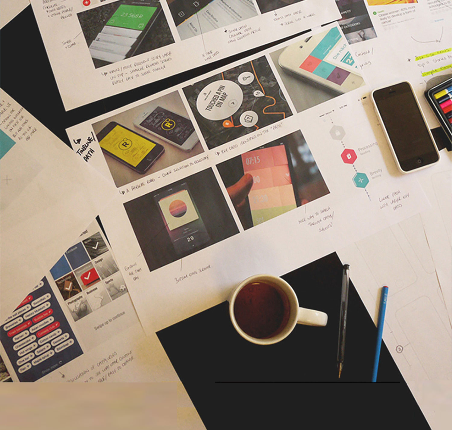
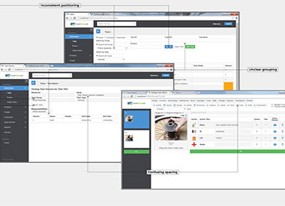
UX/UI Design
My design, development & training background has developed my collaborative, user centred mindset. It enables me to design products that are great online experiences, and at the same time be the advocate for the user while meeting the needs of stakeholders.
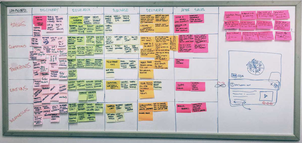
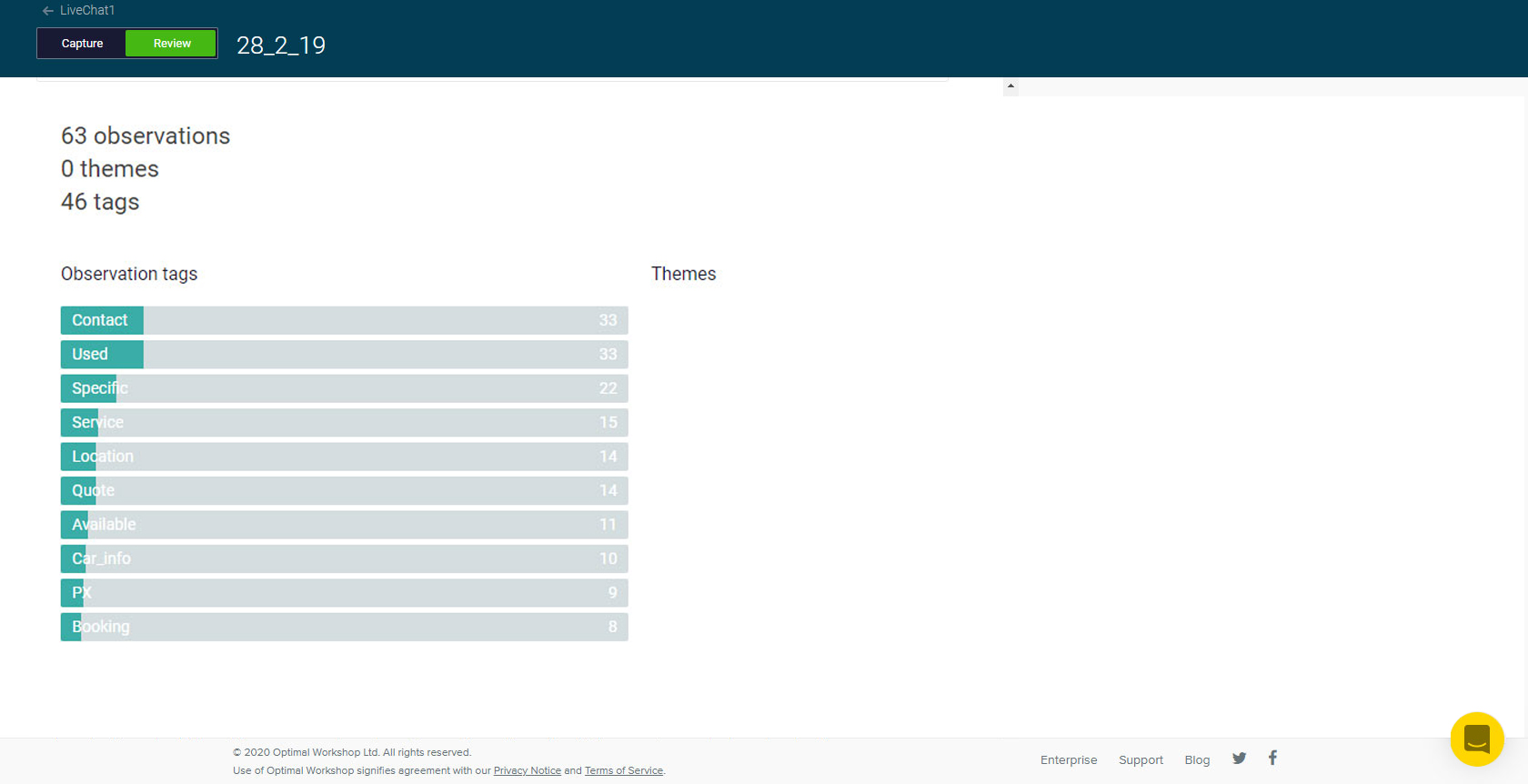
- Research: Current State, Competitor and User
- Analysis: Scenarios, Personas
- Design: Specifications, User Flows, Wireframes, Prototypes
- Production: Design, Production Integration
Coding
I believe in goals, not tools. Building products is my passion, and I love selecting the best tool for the job and coding a great solution.
- Maintainable and well-documented code
- Latest developments and best practice
- Transparent process
Workshops
From design company to manufacturer to charity. I've facilitated workshops & training courses for designers & developers from every type of business, helping them get the best out of their web and graphic apps, to produce better and more effective products.


Work
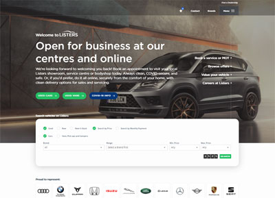

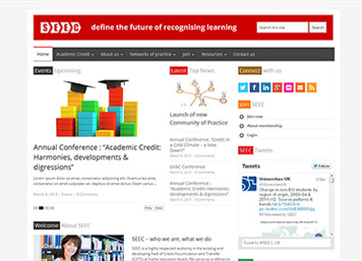
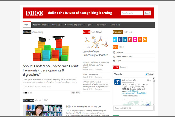
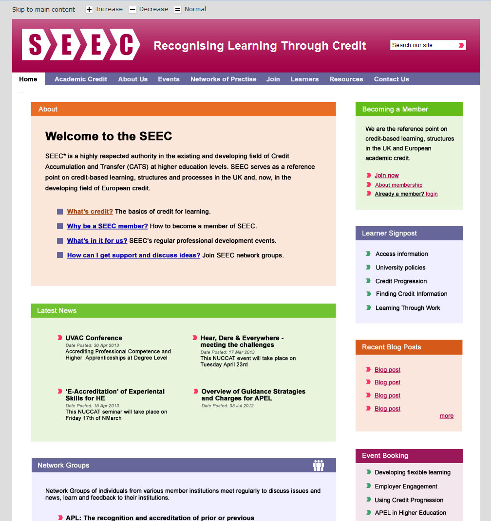
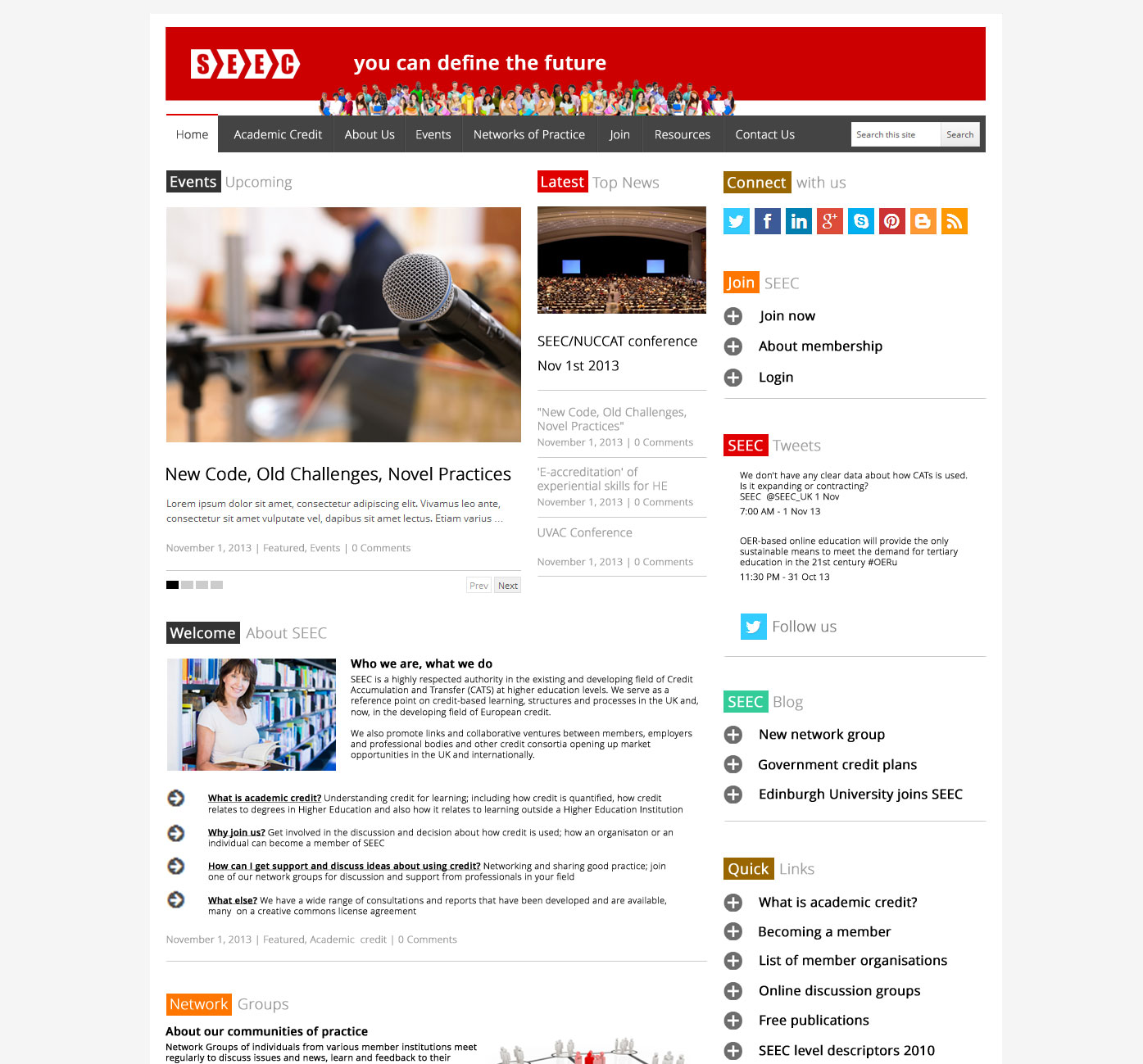
SEEC
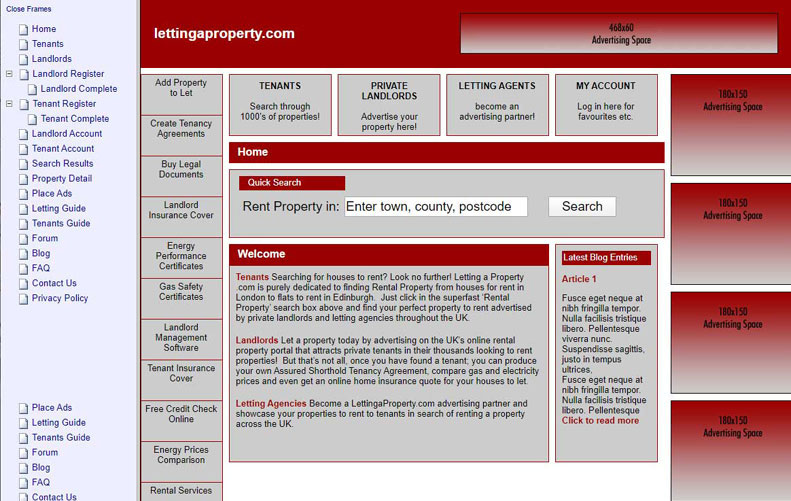
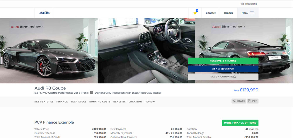
Website Design
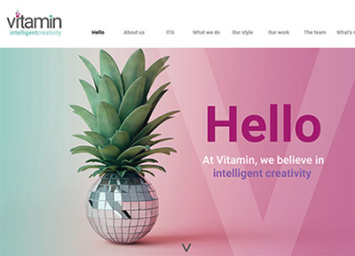
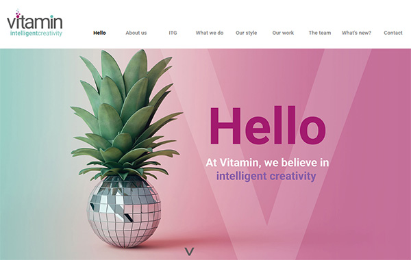
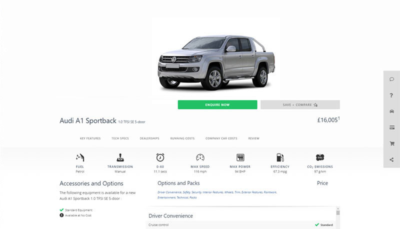
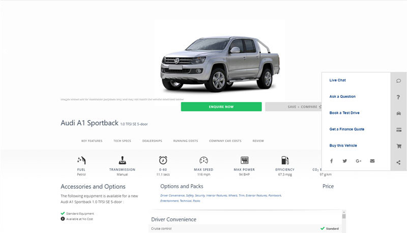
Vitamin Marketing
Web Development
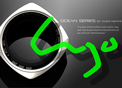
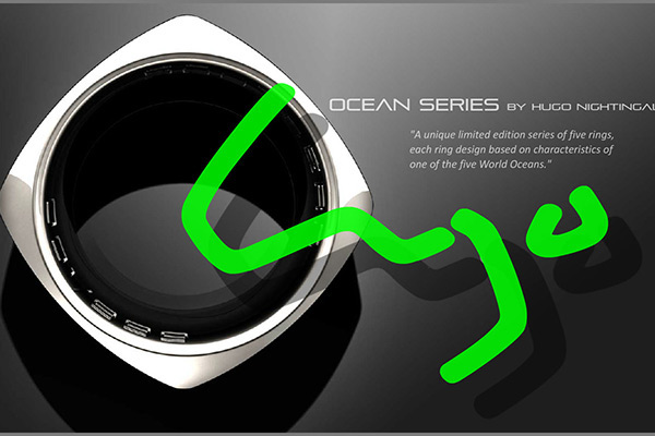
Ocean Series
Website Design
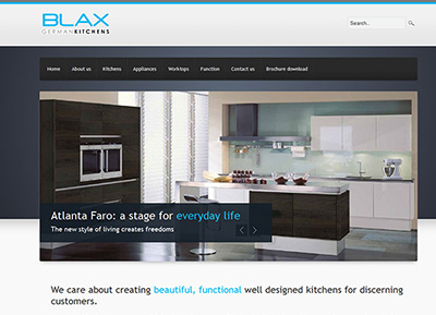
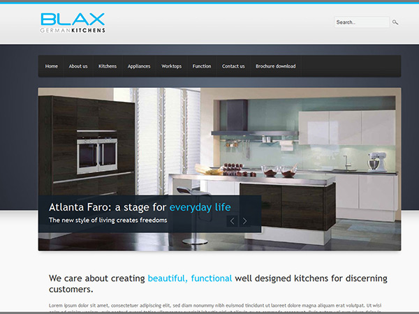
Blax
Website Design
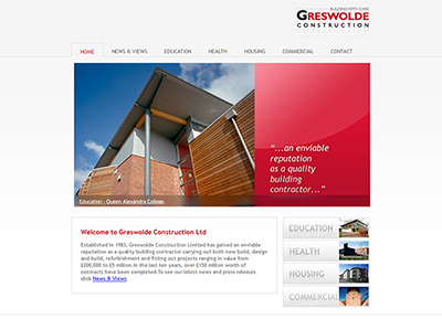
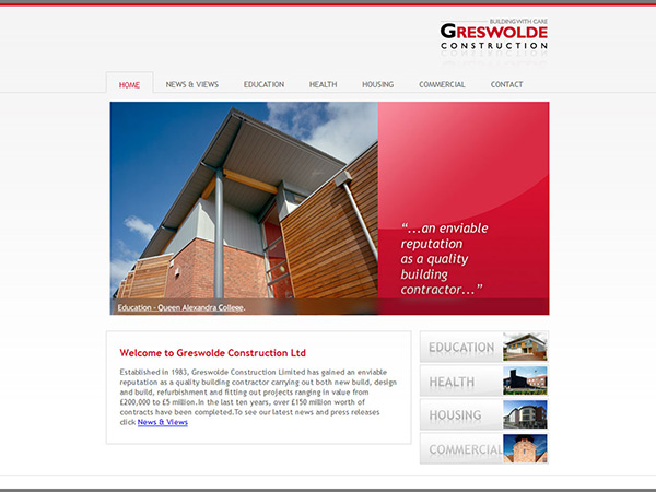
Greswolde
Website Design

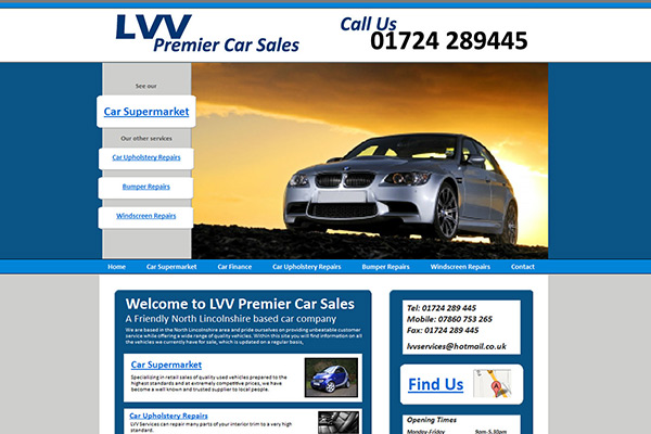
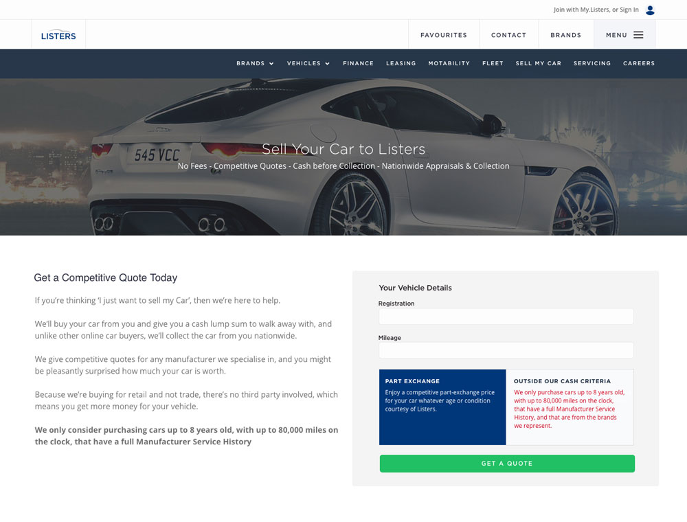
LVV
Website Design